
Nelson garcia
HANDLE WITH CARE- SPOTLIGHT

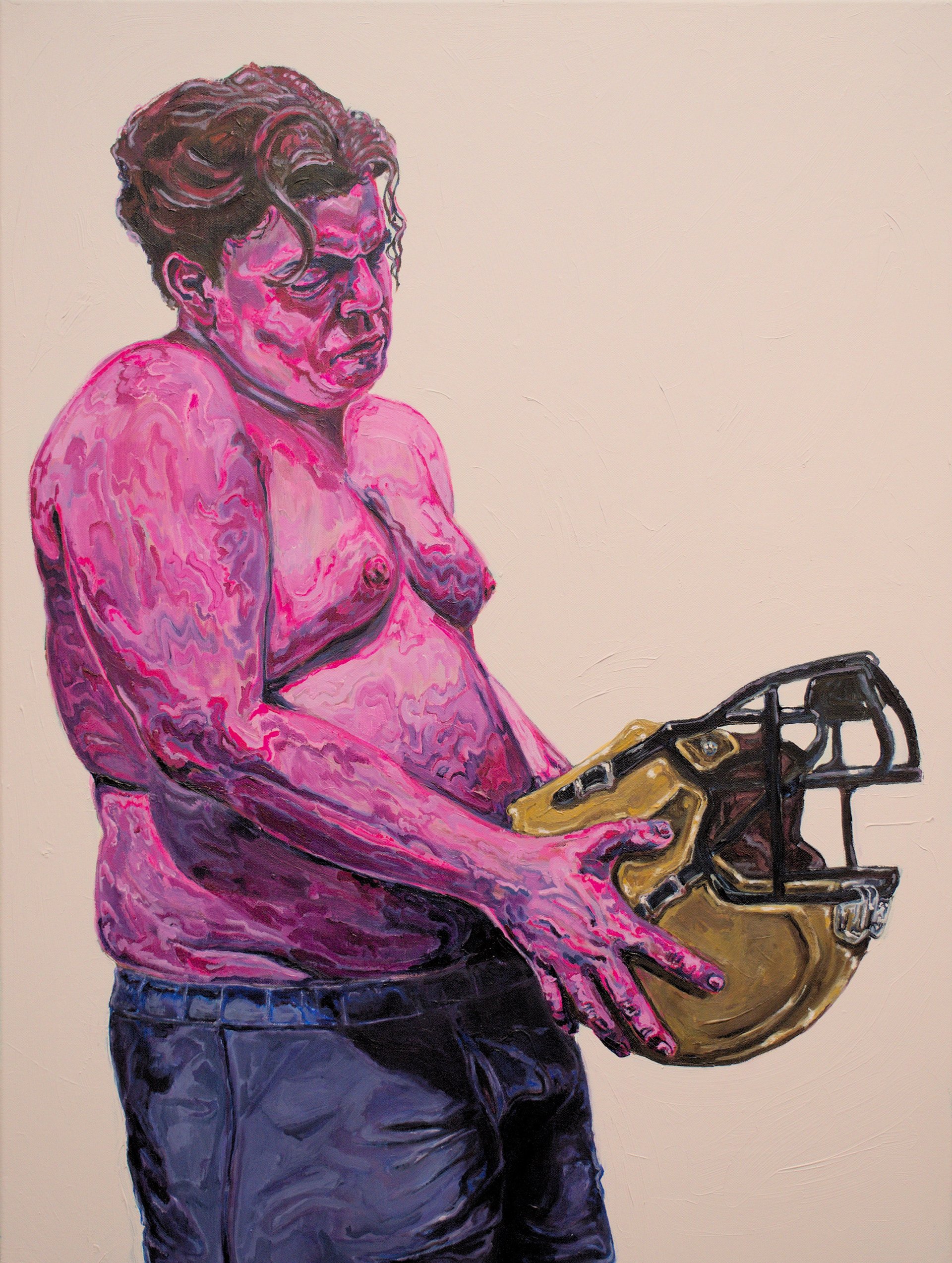
Nelson Garcia is all about texture- visual, physical, tonal- and it all holds meaning in line with his narrative of masculinity, queerness, and home. Figures get pulled from the flatness of the canvas into rich undulating color. Hunks of drywall flakes and peels around delicate, subtle pinks and whites in perfect conversation with the bold stroke and color of his paintings.
An important and deceptively hard skill to have as an artist is knowing when to stop. Knowing when a whisper can be just as powerful as a yell if you’re saying the right words. Seeing the breadth of Nelson’s work side by side shows that sensibility and thoughtfulness that can really lead to some great art.
And with that, here we are in conversation with Nelson.

PW: You sort of seem to sculpt your figures out of color on the canvas. How does color inform your work and what makes you want to push it in sort of strange and dissonant ways?
NG:
Color, for me, is a visual engagement with queerness. From pride flags to protest symbols, queer history is made up of striking, bright, and unapologetic bursts of color. Making it a foundation of my artwork, and allowing it to be flowing, playful, and undulating is how I express my own queerness as something shifting, something dancing, something physical. An experience confined within my person, but ever-changing, like the colors that wrap around my figures.
PW: On that note, what is your favorite color to have on your palette?
NG:
Hyper-specific artist moment, but it’s Quinacridone Magenta, hands down. On its own it’s such a rich, deep, smooth magenta color that adds that same depth to any color it mixes with and lightens to a bright, crisp pink. Absolute favorite of mine, highly recommend!
PW: Talk to us about your portrayal of masculinity! When and how did it click for you that this was the direction your work needed to go, and where do you see it going from here?
NG:
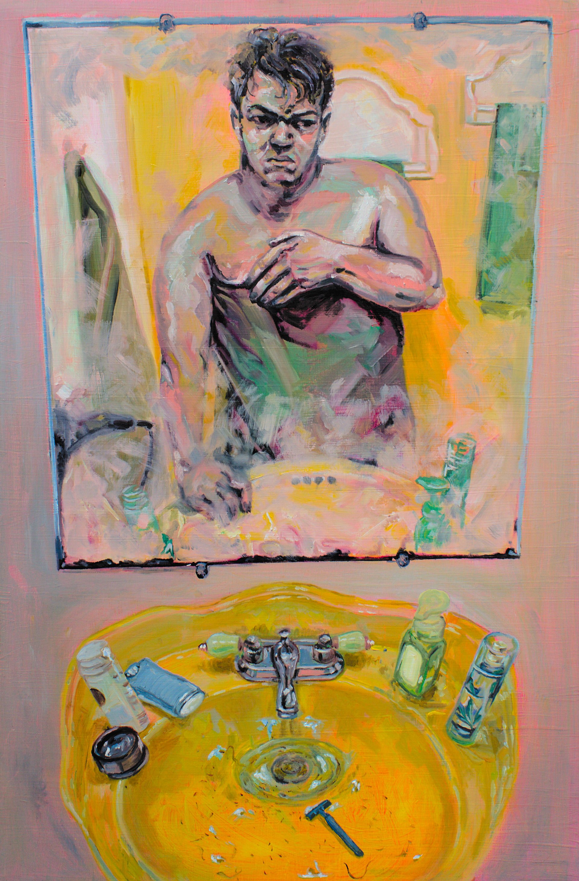
It clicked for me my last semester in my BFA program as I prepared for my graduating exhibition. For the artwork I was making then, I considered all the ways in which I personally did not conform to stereotypically “masculine ideals”, specifically my body type, daily rituals, and sexuality. Man in the Mirror and Melting Down became the first forays into these topics, using self-portraiture to define ways in which I did not meet the “standards” of hypermasculinity. Identifying these stereotypes within patriarchy, however, I found more and more that I was needlessly comparing myself to a mythological ideal. Humor, joy, and colorful expression then became my ways of combatting this ideology, rather than delineating myself in contrast to it. I see my work continuing in this direction, finding ways to utilize the humor found in a more free, open, and celebratory masculinity outside patriarchal confinement.
PW: You’re based in Orlando. What is the reception like for your work in a state that passes legislation such as “Don’t Say gay”?
NG:
In my local community, reception to my work has been nothing but positive. Orlando is home to a thriving and supportive queer community that I deeply cherish, and I have had the distinct pleasure in having multiple meaningful conversations about queerness and masculinity wherever I’ve had work displayed. In 2023, I participated in the 37th Annual All-Florida Exhibition in Ft. Myers, Florida, and found that kind reception extended there, where my submission took second place! I believe that even as Florida engages in deeply discriminatory practices at the governmental level, those of us living here (especially within the arts community) remain committed to diversity, openness, and free expression. I have found, more often than not, that my themes are met with thoughtful, kind, and insightful dialogues between viewers and I!

PW: What was the thought process behind the Stud Finder series as well as the materials used for it?
ng:
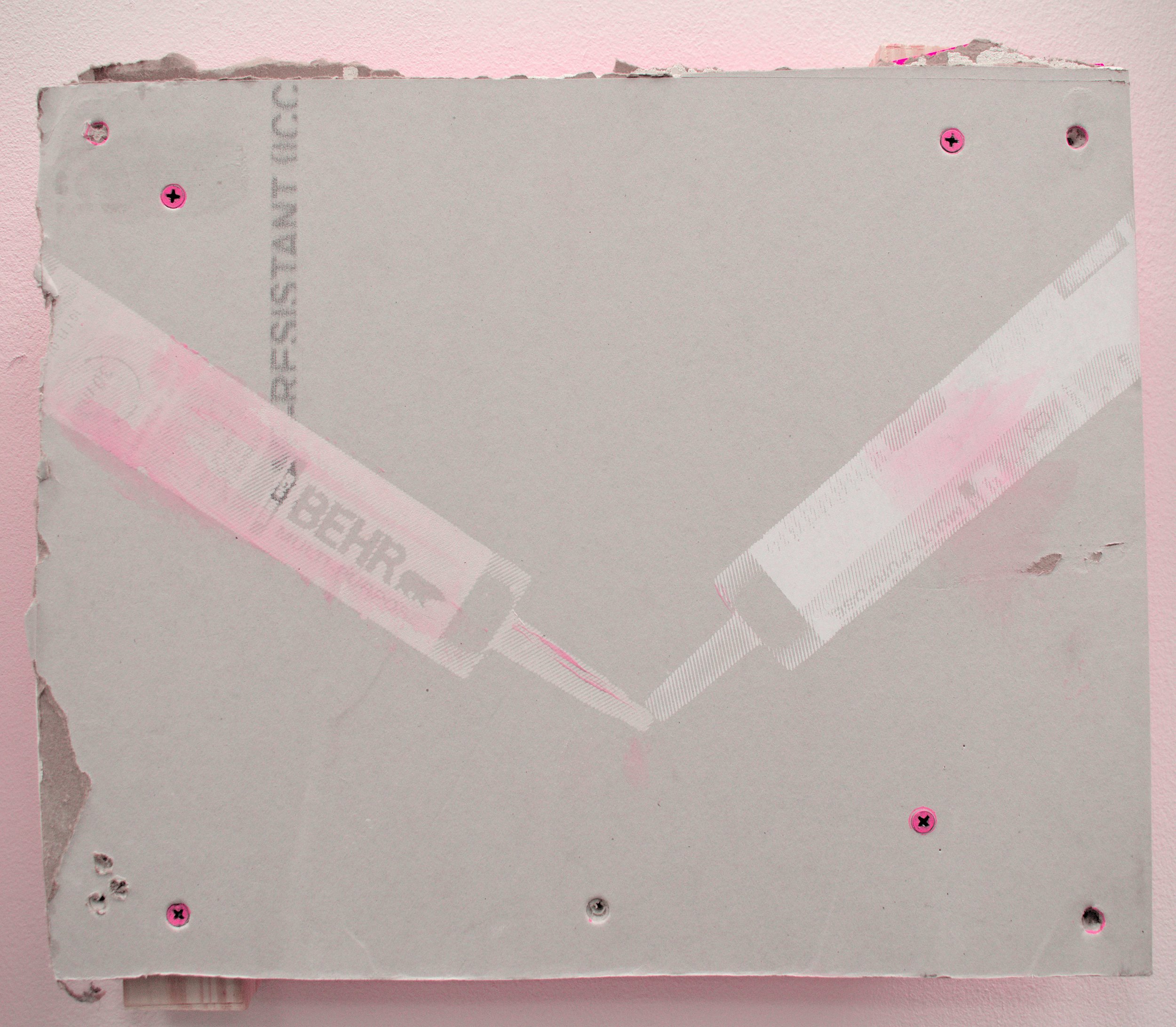
I can honestly say it was truly a right place, right time moment! In artwork I was creating at the time, I was already experimenting with construction-based materials like caulk and wood. As I began to consider printmaking mediums that aligned with this new exploration, my home was in the midst of wall repair. The contractor filled his pickup truck with the scraps of old drywall, and I was instantly excited by their potential. It was the perfect mesh of serendipity and expression. I played with imagery of queer intimacy paired with the construction paraphernalia I was already familiar with. The phrase “if these walls could talk”, as well as anti-queer rhetoric such as “what you do in the privacy of your home is your business”, were ever-present in my mind as I developed the pieces. Leaving exposed the drywall that would normally be mudded and painted over allowed it to become a vehicle for unabashed, unashamed queer sexuality, and a question about what truly makes a house a home.
interested in seeing more of nelson’s work?
A collection of paintings and screen printed works will be on view from April 18th-April 20th.
Friday April 18th 6p-10p
Saturday April 19th 10a-4p
Sunday April 20th 3p-6p
OPENING RECEPTION:
VIEWING HOURS: